01
/portfolio
YIT · YNET / 2024
Saas
UX Research
Product Design
Component Design
Design System
Sole Product Designer

Redesigning the system 200+ writers use daily - without breaking the workflow they trust.
About the project
Tamka is the internal CMS behind Ynet - Israel’s largest news network. It’s not a side tool: it’s where 200+ writers and editors draft, format, publish, and report on everything that goes live, often under deadline, all day. At YIT, I joined as the system was moving onto a new foundation, and as the sole designer, I owned its screens and components from there.
The old system had grown heavy - a complex interface, thin formatting tools, and unused components piled up over the years. My job wasn’t a cosmetic refresh. It was to make a high-pressure professional tool faster and clearer to work in, without forcing the people who lived in it to relearn their craft.


A writer’s daily path: log in, pick the system they’re working in, land in a dashboard built around what they actually do - drafting, formatting, publishing.
The approach
The real question wasn’t “what looks more modern.” It was what would make a professional tool feel faster to a person who’s used it for years. Every change had to earn its place against muscle memory - clarity people would actually feel, not novelty they’d have to fight.
So I designed in two directions at once: a cleaner, calmer interface that strips out clutter, and a consistent component system underneath it - built in close, constant dialogue with the front-end team, so what I designed was always what could ship. Built to feel like relief, never a relearn.


Strategic Decisions
Design within what could actually be built
Tamka runs on an existing, evolving codebase, so the front-end team had real limits on what they could implement. Instead of designing the ideal and tossing it over the wall, I sat with the developers to learn exactly what was buildable and what wasn’t - then designed components that lived inside those constraints. The result was a system that shipped, not a portfolio mockup that didn’t.
One system, different jobs
A writer drafting a story and an editor approving one don’t need the same screen. Rather than one bloated interface trying to serve everyone, I designed role-aware workspaces - writers get drafting and formatting front and center, editors get approval and oversight - so each person sees the tools their actual job needs, and little else.
Ship it, then listen to the people who use it
I was there when the new system went live to real writers and editors - and that’s rarer than it sounds. The truth: people resisted at first, because they were attached to the system they knew. I took that feedback seriously, treated the friction as data rather than failure, and adjusted components based on how the newsroom actually worked once the dust settled.
What I designed
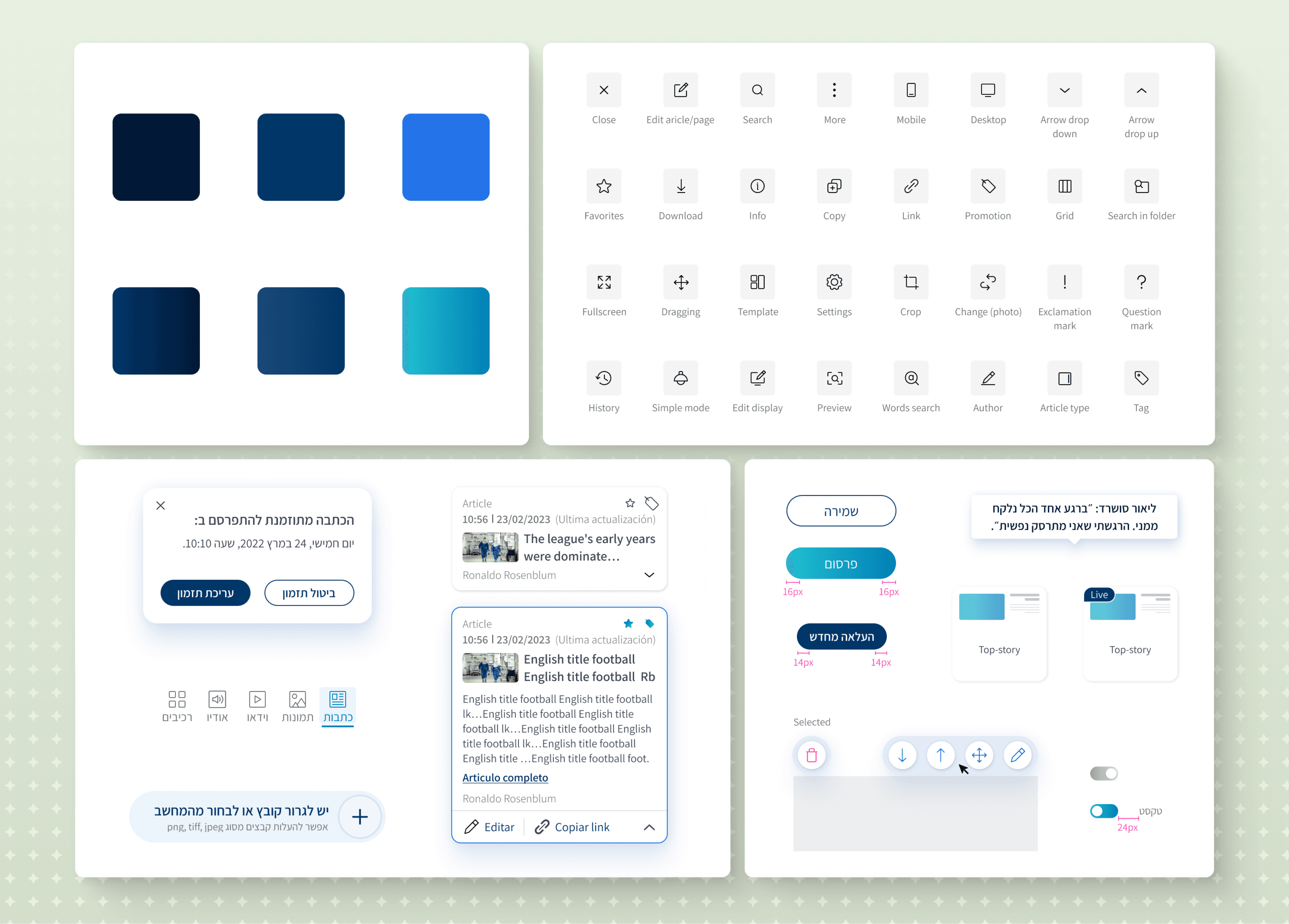
As the sole designer on this push, I designed the screens writers and editors touch every day: the log-in and system-selection flow, the customizable main dashboard, the Multistrip content editor, the articles performance report, the comments blacklist-management tool, and the video upload and encoding flow - all sitting on a consistent component system I maintained and extended.


Results & Reflections
friction, then fluency
Daily writers & editors
Screens designed
Core workflows owned
The takeaway
Redesigning a tool people already depend on is less about beauty and more about respect - for their habits, their deadlines, and the developers who have to build it. The real win wasn’t that everyone cheered on launch day; it’s that the friction faded and the work got faster. Designing inside the front-end’s real constraints is what made it ship at all.
With more time, I’d run structured user testing with writers and editors before and after launch - to soften the transition deliberately and measure the efficiency gains I could only feel anecdotally. From there, I’d push into AI-assisted drafting and stronger mobile support.
02
/see more


