01
/portfolio
ONE TECHNOLOGIES · YIT / 2024
B2B
Responsive Web Design
UX/UI Design
Bilingual - LTR & RTL
Design System
Sole Product Designer

Modernizing an enterprise site without losing the trust behind it.
About the project
ONE Technologies is one of Israel's biggest IT companies - 10,000 tech experts, $1.37B in yearly revenue, 6,500+ customers. And it had a website that made it look small. The company was rebranding and targeting English-speaking markets, but the site was only in Hebrew and still reflected who they'd been, not who they were becoming. At YIT, I got the full redesign - end-to-end, in both languages.
And that raised the bar. Until now, the site has only had to look good next to other Israeli companies. Now it was going to sit in front of people who spend all day on the websites of global IT firms - and it had to feel like it belonged there, not like the translated version of a local site. Two languages, two directions, every screen.

The approach
The real question wasn't "what looks more modern." ONE sells to enterprises. Their buyers are IT managers and CFOs, and their investors read this site too. If the redesign came out looking like a startup landing page, it would cost them exactly the credibility a rebrand is supposed to buy. So the target was narrower and harder: current enough to back up the new brand, serious enough that a procurement team trusts it.
And every decision had to work four times over - Hebrew and English, desktop and mobile. Each layout is designed twice for direction, then again for screen size. That constraint turned out to be useful: when a layout has to survive a full mirror and a collapse to one column, decoration falls away fast. What's left is structure. Built to feel like one company, whichever way - and on whatever screen, you read it.
Strategic Decisions
three calls that shaped ONE
Designed to read, both ways
Flipping layouts from RTL to LTR was the part everyone expected. What actually took the time: Hebrew is a different animal. It has no Gilroy, so I paired a Hebrew typeface and tuned it until the two read as one voice. It runs shorter, so components designed around English lengths looked empty in Hebrew - every card and button had to work at both widths. One system, four outputs, neither one the original.
Modernizing Trust, Without the Startup Hype
The trap in every corporate rebrand: chase "modern" and end up looking like a startup - which, for a company selling reliability, is worse than looking old. The audience here is IT managers and investors, people who read polish as risk. So every visual choice pulled toward calm confidence instead of flash. Moved forward, same company.
Dense content, not hidden content
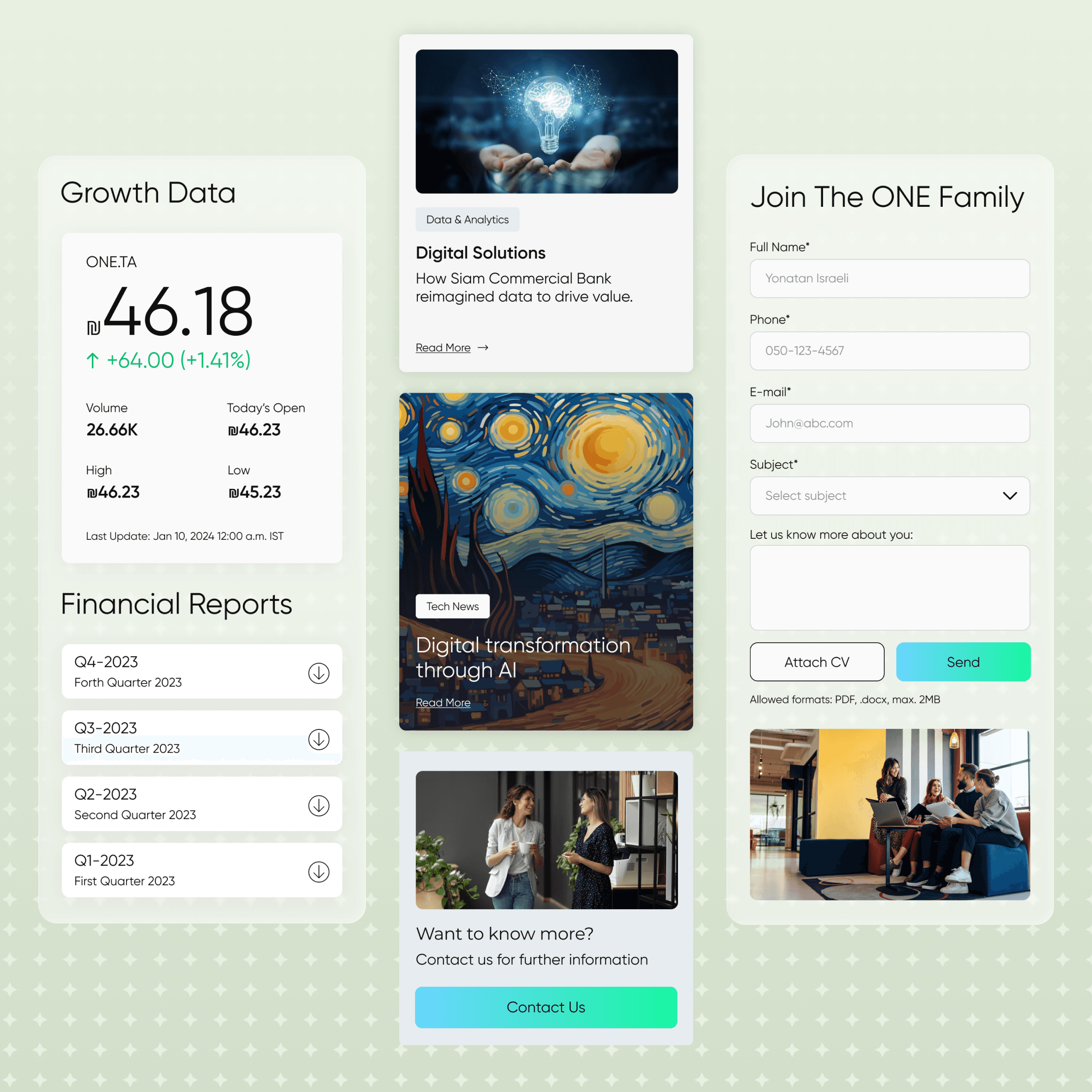
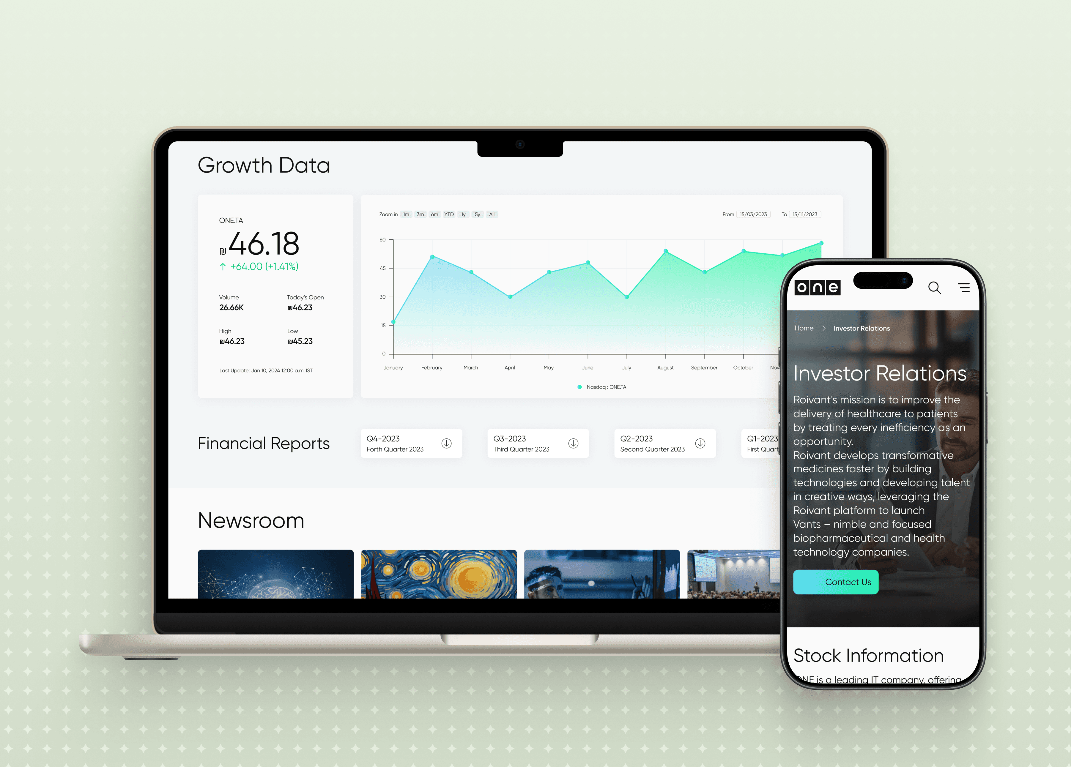
A corporate site like this carries weight: service catalogs, FAQ, careers, news, and an Investor Relations section full of numbers. The temptation is to bury it. Instead, I restructured it - clear categories, honest hierarchy, and charts for the investor data so the numbers read at a glance. The dense pages didn't get thinner. They got navigable.
What I designed
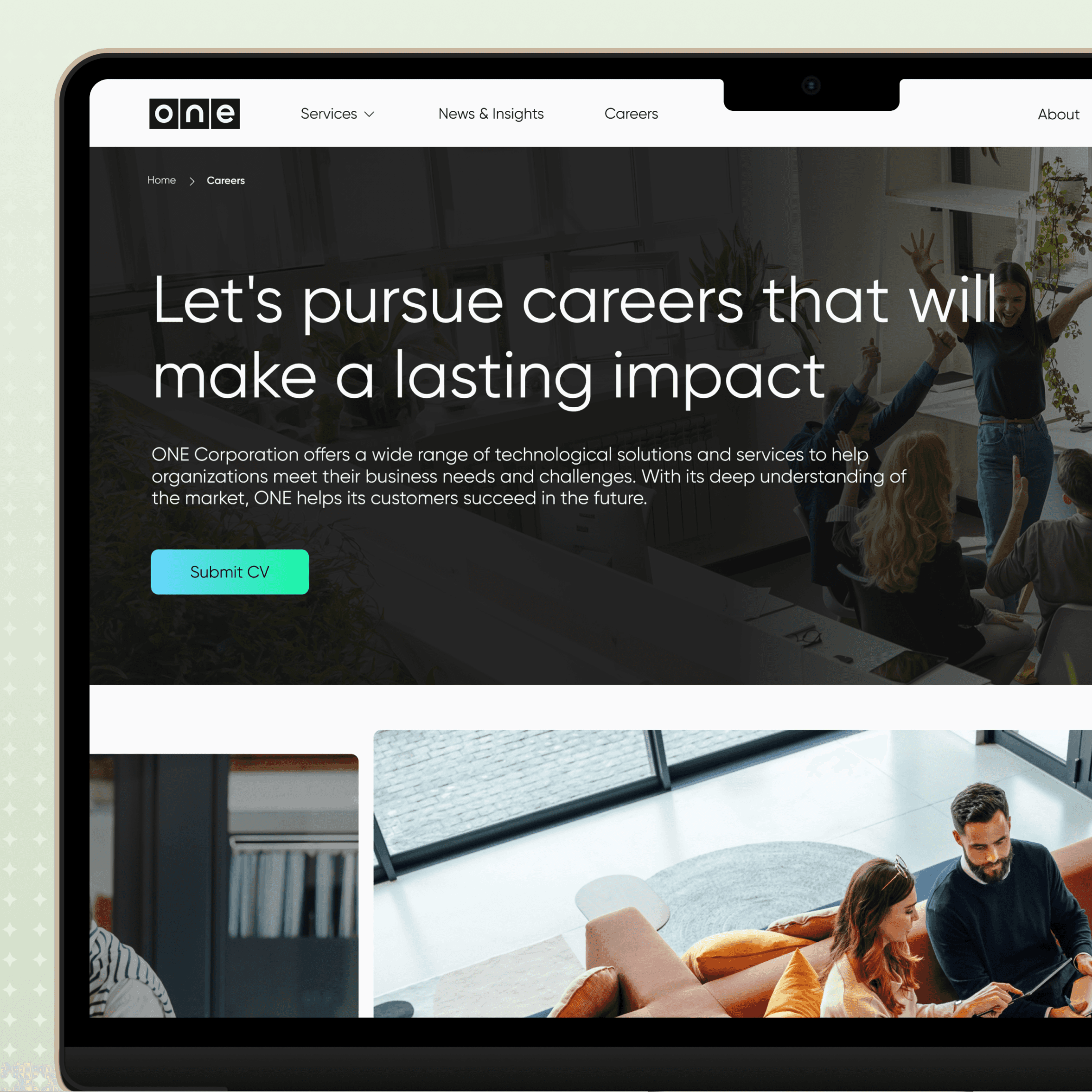
As the sole designer, I owned it end-to-end: research, UX/UI, and the design system. Homepage, services and FAQ, Investor Relations, careers, about, news - every page in four versions: Hebrew and English, desktop and mobile. Development happened at their end, by a team I never sat with - so everything I handed off had to stand on its own: documented, consistent, and buildable without me in the room.

Results & Reflections
live, both eays
Screens designed
Languages, opposite directions
Site sections
The takeaway:
Designing bilingually taught me something I now apply everywhere: a system that survives being mirrored is a system that was actually designed, not decorated. The RTL/LTR constraint forced every component to earn its structure - and that discipline is why a dev team I never met could build the site from my handoff, and why it's still live today.
I handed off before launch, so the loop never closed. Given the chance, I'd go back for the part I missed - watching real visitors use it, especially English-speaking prospects hitting the site for the first time - and let that reshape the service pages. A design system can be handed off. Judgment about what's working can't.
02
/see more


