01
/portfolio
WYZLY / 2026
B2C • E2E
AI-Based Mobile app
Two-Sided Ecosystem
Motion & Animation
Design System
Sole Product Designer

Wyzly: Where kids play to earn their screen time.
About project
Screen time is the single biggest daily fight in most households - 60% of parents feel overwhelmed by it. Every existing solution works the same way: block, lock, ban. That makes the parent the enforcer and the child the loser, and the arguments never stop.
Wyzly flips it. Instead of taking time away, it lets kids earn it back through quick learning. The challenge handed to me: design that loop so a 5–12 year old actually wants to do it - across two devices, two very different users, one connected system.


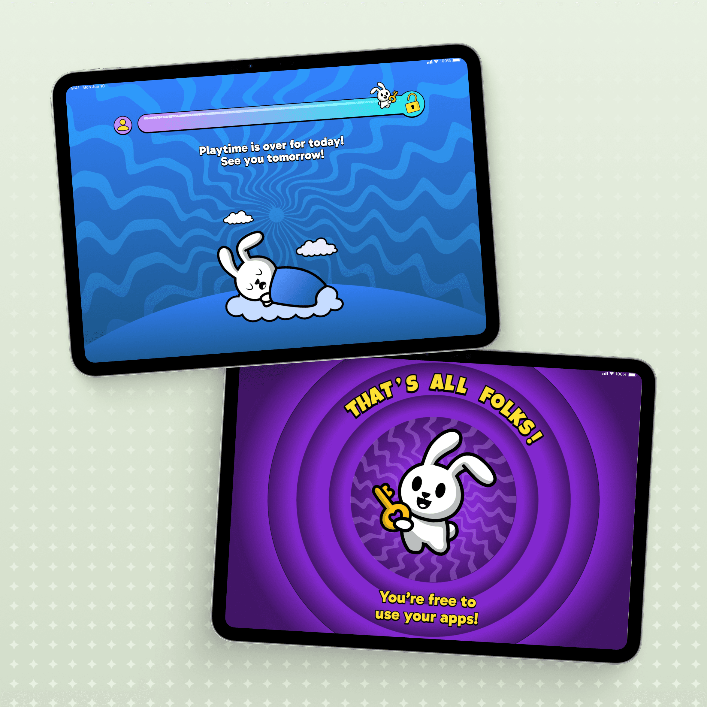
The core loop: time runs out, the bunny takes over, the child answers a few questions, and earns their apps back. No parent in the middle.
The approach
The real question wasn’t how to build a screen-time tool - it was what would make a child choose to engage instead of resent it. Where every competitor is parent-centric, Wyzly had to be kid-centric: the child is the protagonist, learning is the game, and the parent quietly sets the rules from the background.
Two products, designed in parallel: an immersive, game-like world for kids on iPad, and a calm oversight dashboard for parents on iPhone. Each adapted to its platform - nothing borrowed, nothing generic. Built to feel like play, never punishment.


Strategic Decisions
three calls that shaped wyzly
The child had to want to open the app
We designed the visual language to compete with TikTok, not Khan Academy. If an educational quiz looks like school, the child has already checked out. By centering the experience around a coaching mascot rather than cold UI, we removed the shame from wrong answers and kept parents out of the friction. The reward animations weren't visual polish - they were the core mechanism driving the user's motivation to unlock more.
Paywall before the hard part, not after
We placed the subscription screen before the multi-device pairing sequence, not after. Asking for payment once someone’s already fought through a technical setup destroys trust. Showing the free trial before the friction built goodwill at the right moment - transparency protected conversion.
A visual manual for the scariest moment
Device pairing was where most parents gave up - not from unwillingness, but because the step felt unfamiliar and technical. We replaced the single instruction screen with an illustrated, step-by-step walkthrough showing each moment as it appears on the real device. The setup completion stabilised immediately.
The child’s journey
Every screen the child sees was designed to feel like the next beat of a game, not a gate. The flow is short by design, 3-5 questions, about five minutes, and the world opens back up. The background shifts with every subject: 19 subjects, 5 backgrounds each, 95 unique environments, so a session rarely looks the same twice. I designed and animated the motion across the whole loop myself.


Results & Reflections
Behavioral proof, not volume
Onboarding-to-paid
Products, one system
Visual environments
The takeaway
Monetizing a kids’ product means designing for two opposing users at once — a child who wants freedom and a parent who wants peace. The win was making the child the protagonist without losing the parent’s trust: high conversion and a calmer household.
Profile and reward moments landed strongest. Next, I’d push the affirmation system further - adapting the bunny’s tone to each child over time, so encouragement feels personal rather than scripted.
02
/see more


